Placester Content App
A transportable way for real estate agents to manage website content
Placester works in the real estate industry, providing CRM tools and website services to real estate agents around the nation. This content consists of blog posts, email blasts, newsletters, and pages that Placester provides monthly to real estate agents for them to publish to their websites for their clients to see. Real estate agents are constantly on the go, making it hard to stay connected with Placester's resources without a mobile app.
The goal was to create a transportable way for agents to view, edit, and publish any content Placester provides for their agents' websites.
My Role
I owned this project and had the opportunity to lead this vision during my time at Placester as a UX Design intern. I worked with my Rishi Dean, my Product Manager, and 2 mobile engineers to make it come to life.
Category
Product design
Project Duration
Fall 2017, on-going 2-3 months
Tools Used
Sketch, InVision
THE PROBLEM
Real estate agents were not as engaged in our resources as much as we wanted them to be, and we found that they were often not checking up on our published content because they were constantly on the go
There was a lack of connection between Placester's clients and Placester as a company. We wanted to strengthen our relationship with our clients and provide them the very first Placester app to help them manage website content.
THE SOLUTION
We created the Placester Content app, a convenient way to access, control, and easily customize personalized content for their websites
It aimed to solve the problem of lack of connection by giving our customers a more transportable way to stay connected to Placester content.
Real estate agents could view content on a dashboard, edit that content, and either save as draft or publish it directly to their website from this application. The enablement of customization gives customers a chance to spin the content more to themselves, creating loyalty and satisfaction.
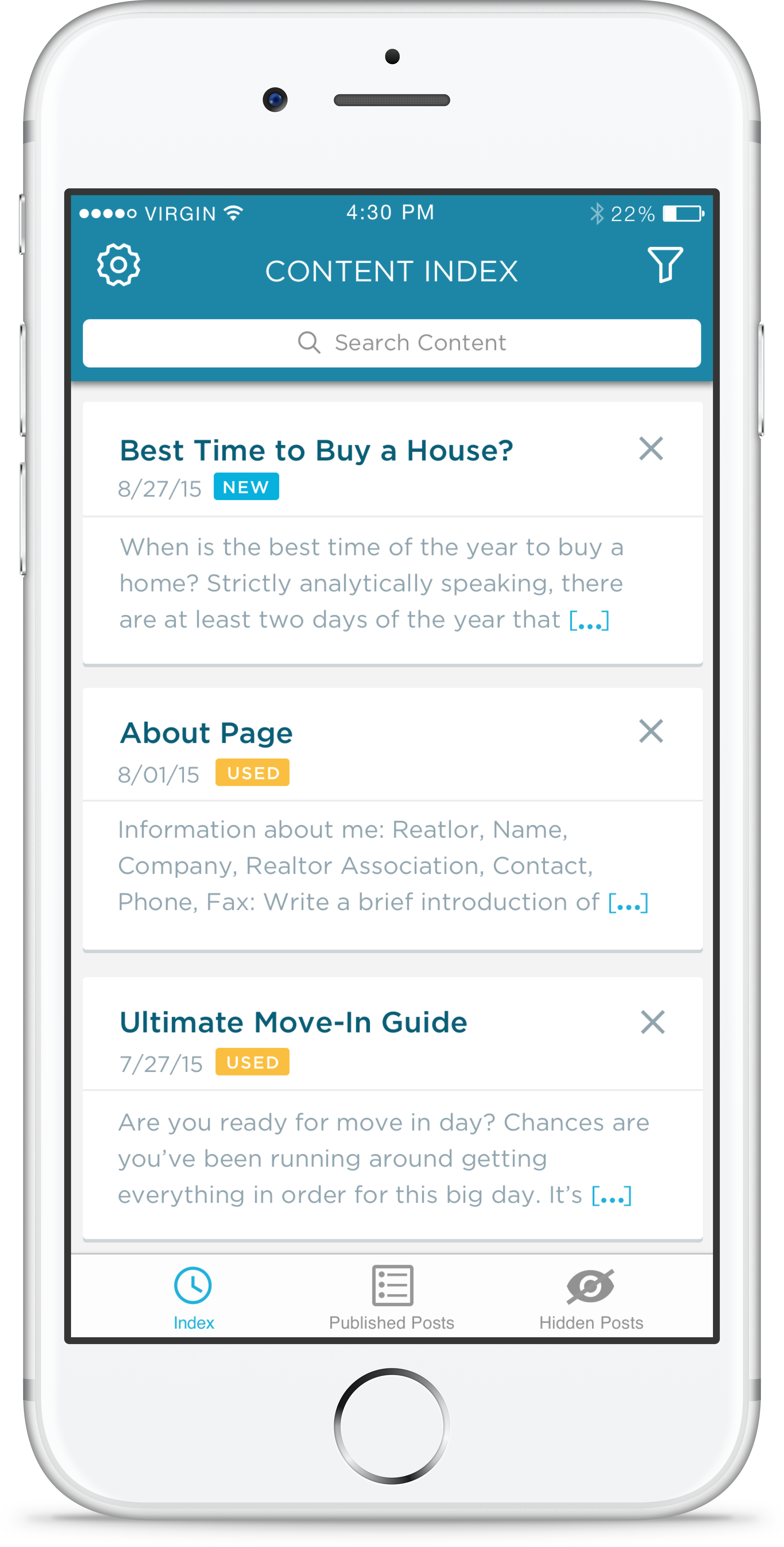
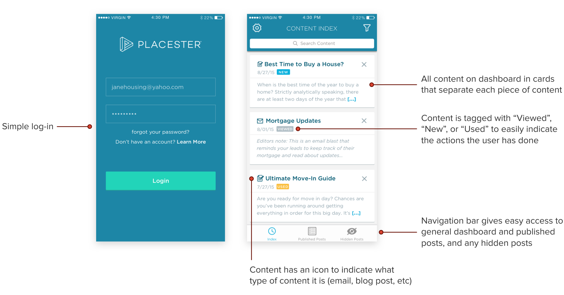
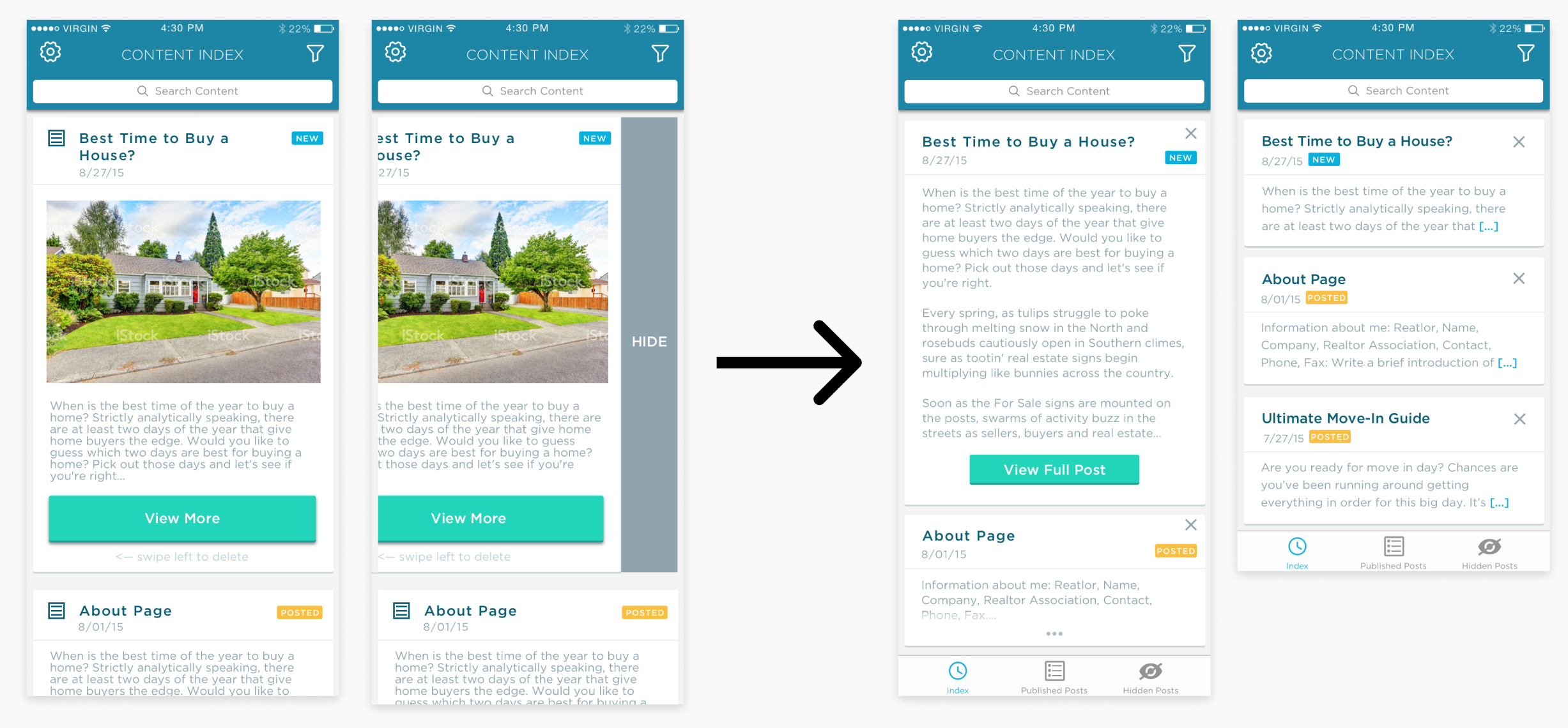
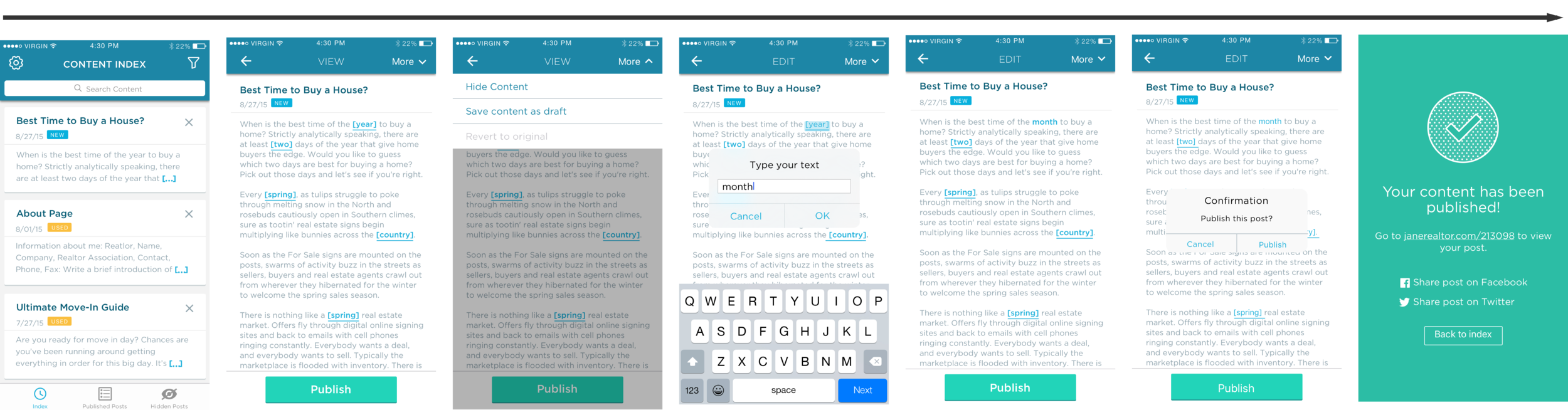
1. Convenient access
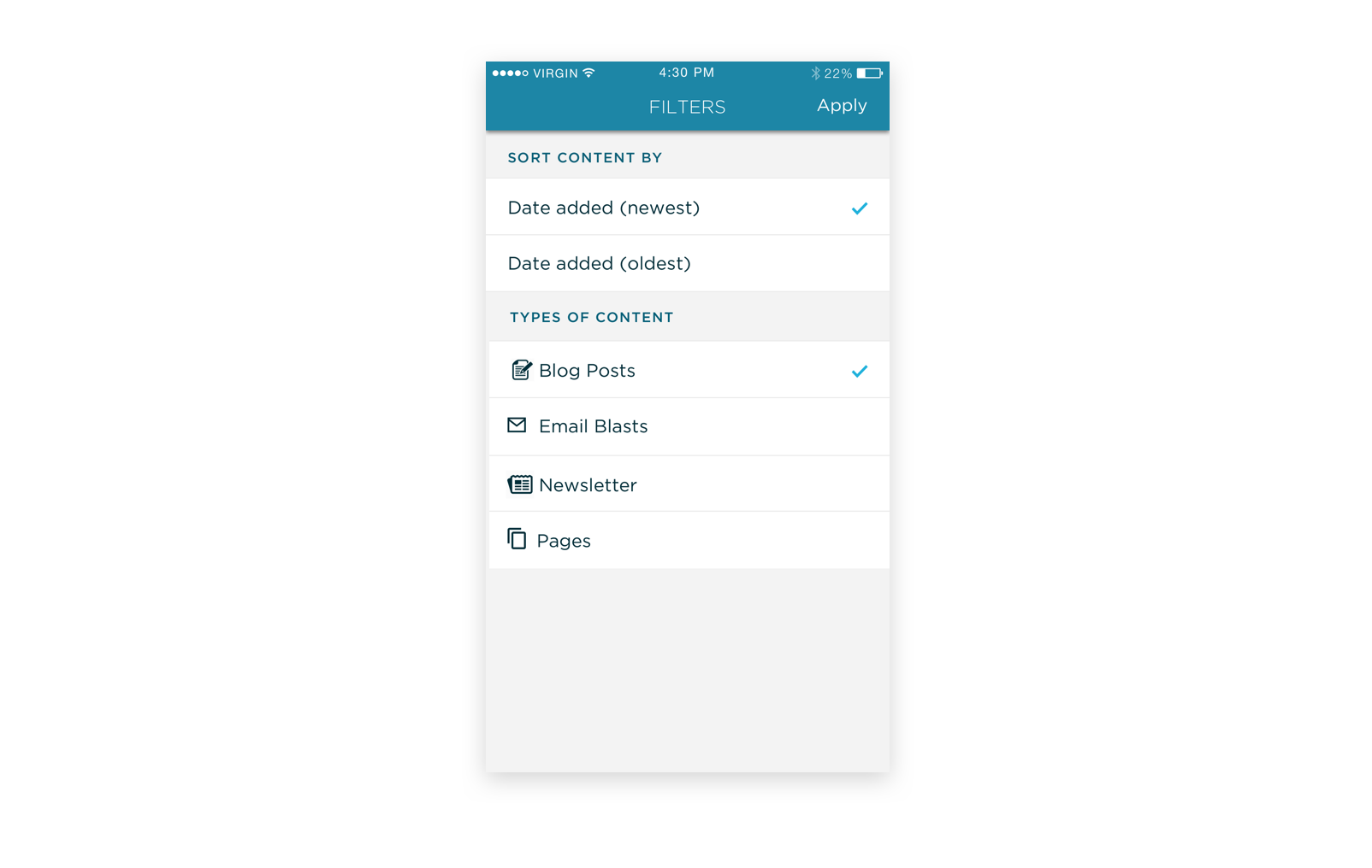
Right when the app loads, the customer can see all the recent and past content Placester has published out on a dashboard feed. As the customer scrolls through this feed, they can see the type of content by the icon and a badge to indicate if the content has been viewed, used, or is new– right at their fingertips.
2. Easy customization for personalized content
Two main types of customization:
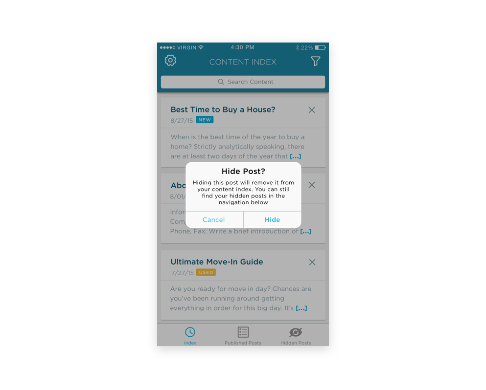
- On the dashboard, tapping the "x" for a content box will allow the customer to hide the content if they do not want to see it. This way, their dashboard is customized to what they only want to see.
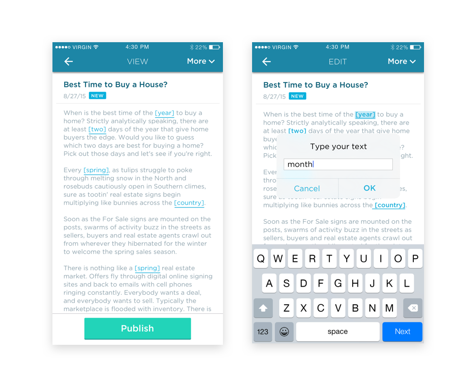
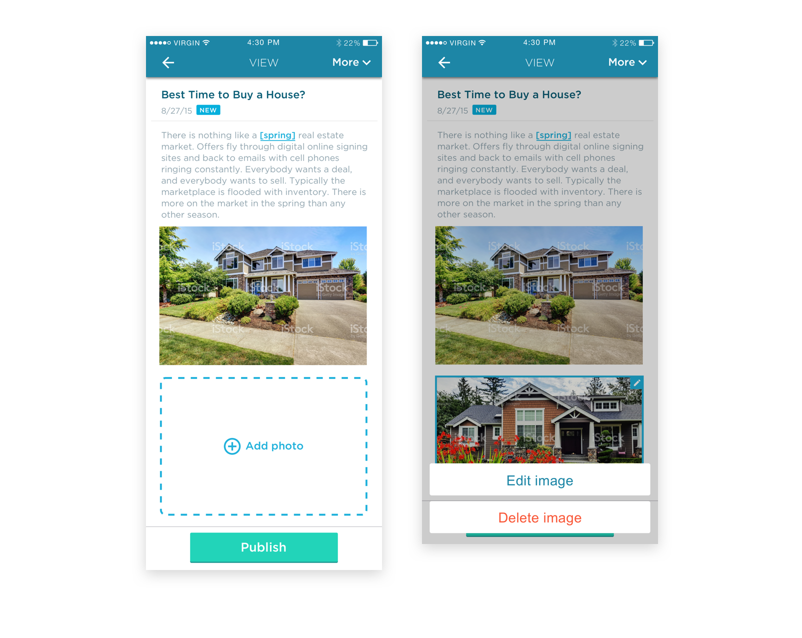
- Clicking into a piece of content will give its full view, where the idea of "mad-libs" used. This was something that Placester's CEO wanted to experiment with, so I created the experience for it. For certain words, the customer can tap and change that word. For example, add their appropriate location/country/year. This gives a bit more customization and doesn't limit every customer to the same piece of content.
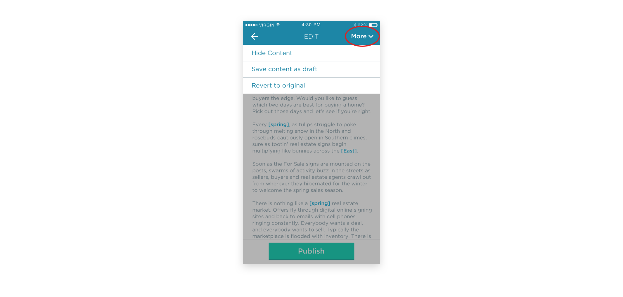
3. Control over content
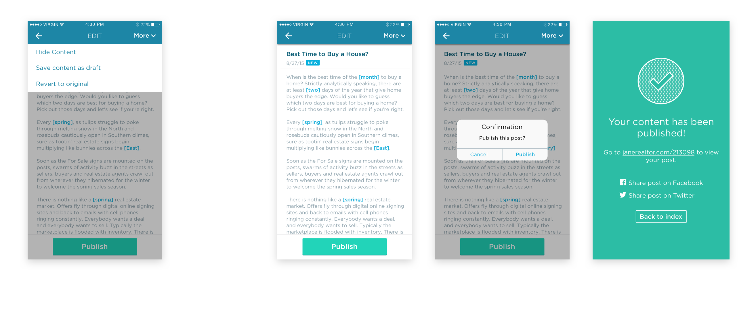
Placester customers will be able to easily control the content they choose to use on their website. The "more" options allow them to hide the content or save the content as a draft to publish later. Besides that, tapping the green CTA "publish" will give them a confirmation module to accept, and done! Published!
MY PROCESS: THE DISCOVERY
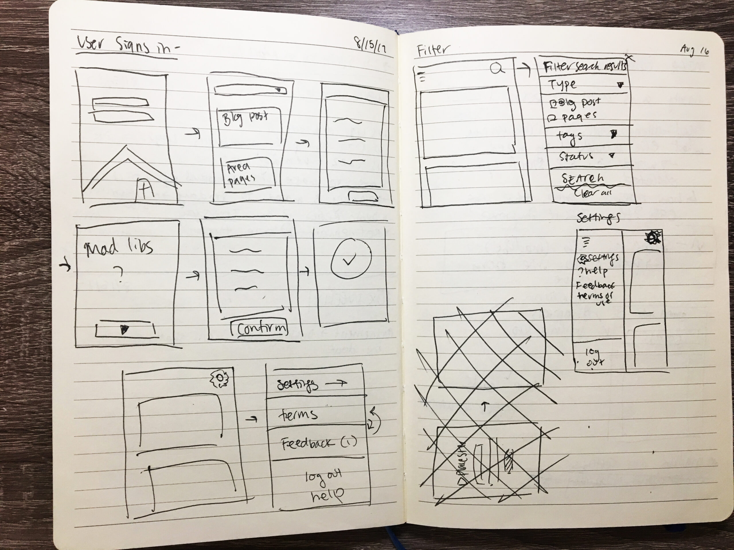
Initial brainstorm
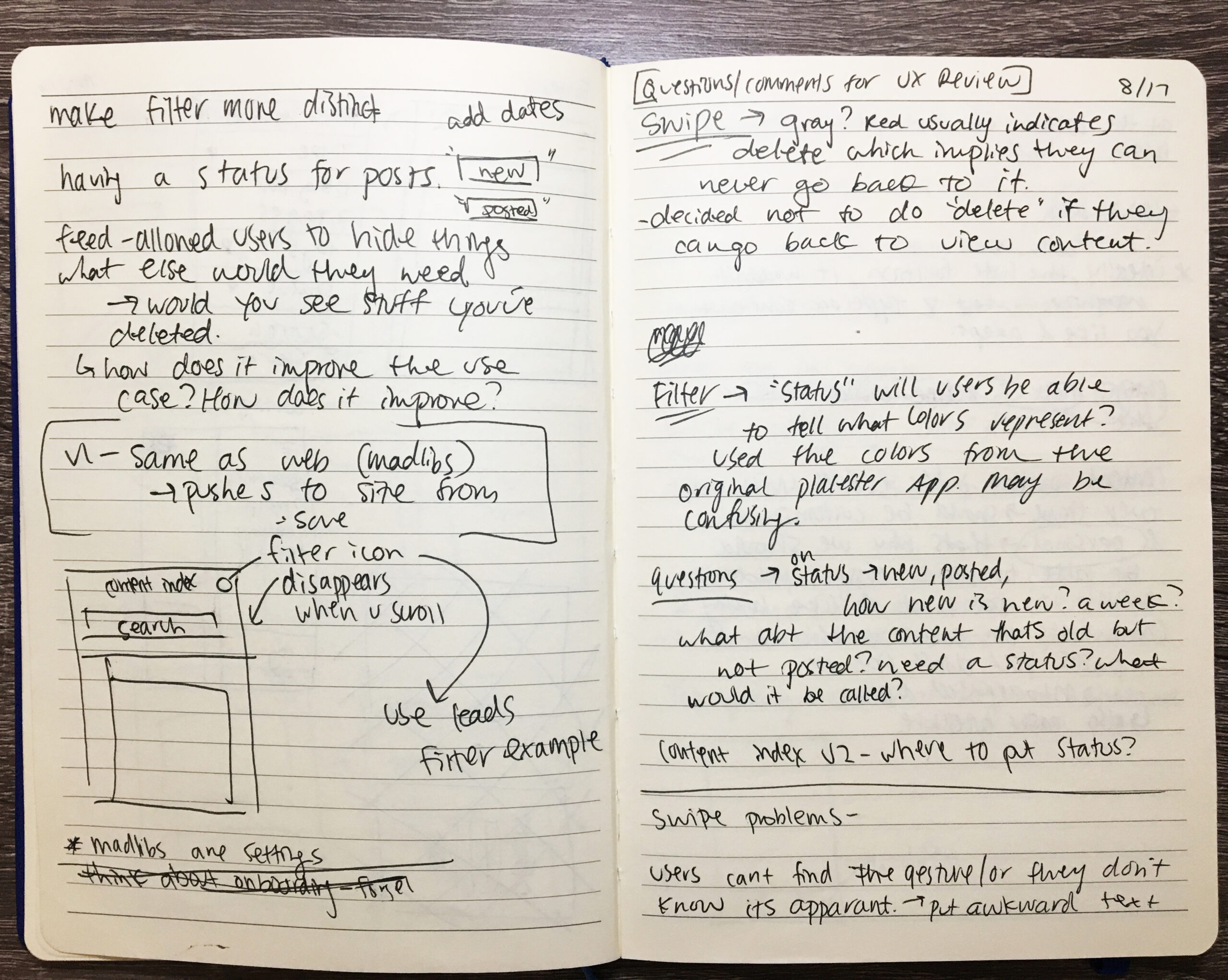
I started off listing all the things a realtor/agent may need to do the tasks in the app. I brainstormed features, functions, sketched out some rough flows of publishing content and filtering out content in "settings."
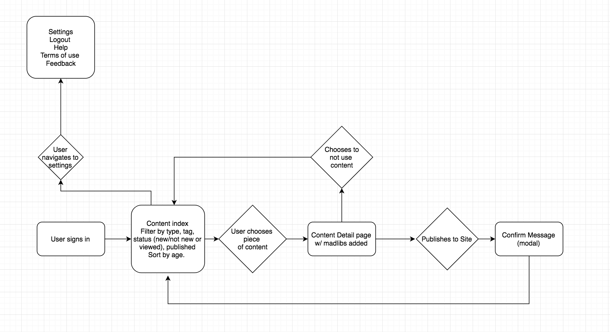
MY PROCESS: THE STRATEGY
Mapping out the experience to start visualizing the user process
This included other experience paths and actions.
MY PROCESS: CHALLENGES
1. Understanding how to convey information in small bits – using space better
I started off designing the dashboard with huuuge! content cards. I wasn't aware of the limited space I had on mobile, and made everything unnecessarily big. The interaction of "swiping to hide" was very awkwardly tall and it was just too intense
I did a couple interactions after that, eventually removing all buttons since a card indicates that you can tap anyway. I narrowed down the preview content to make the cards shorter, and replaced the swipe functionality with a simple "x"
2. Understanding where to put primary and secondary actions
I originally thought of "viewing" and "editing" a piece of content as two steps: if you wanted to edit content, then it would reveal the mad-libs- this wasn't efficient because the user had to go through one more step to view mab-libs.
There were also just too many actions (hide, edit, revert, save the draft, and publish) that I tried to divide out into these two screens.
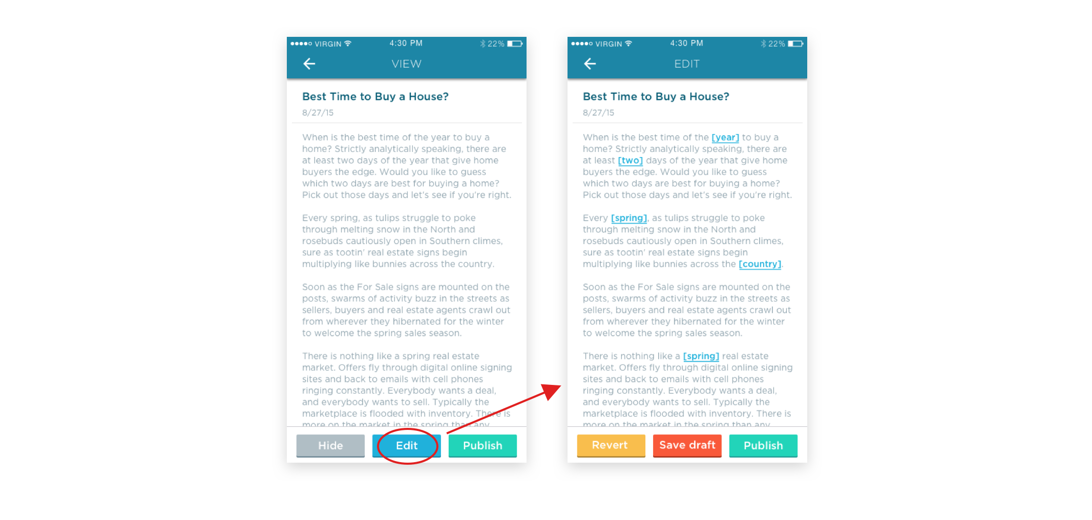
After getting feedback from my team, I learned that the primary action of "publish" should be the only control in the bottom navigation because it's the most important function- the CTA. Other actions like "hide content, save as draft, and revert," can be secondary options in a top-right menu. Viewing and editing content did not have to be in two steps. Once a user clicks on a piece of content from the index, it should already be in edit mode with mad-libs visible. It takes away one more unnecessary step.
MY PROCESS: DETAILS
Expanding customization to easily distinguish types of content
My UX team and I designed different icons to distinguish different types of content from each other in the content index. The user would be able to filter the index by newest, oldest, or content type! This keeps their dashboard clean and only returns the content the user actually wants to see if the way they want to see it!
I applied the same concept of text "mab-libs" to photos: I created a photo adding functionality so the user could add his/her own photos in the content as well. This also gives them some more customization to their blog posts.
FINAL PRODUCT
A convenient way to access, control, and easily customize personalized content
All in all, Placester's content app was a new way for agents to carry our content with them, customize that content, and have easy control of how to put it on their websites. This was the final main flow of picking a piece of content, editing the mad-lib, and finally publishing.
Additional Version
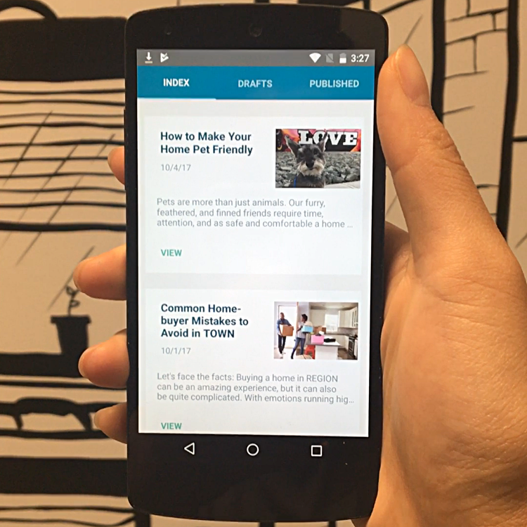
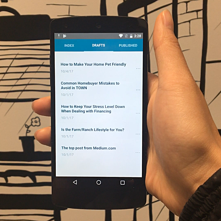
I also designed this app for Android for version 1 of the content app. The engineers were learning React Native, we decided to simplify the content app into a feasible, simpler version that can be used on both iOS and Android platforms.
This simplified version just allowed a user to save a piece of content as a draft, go to drafts, and then publish it.
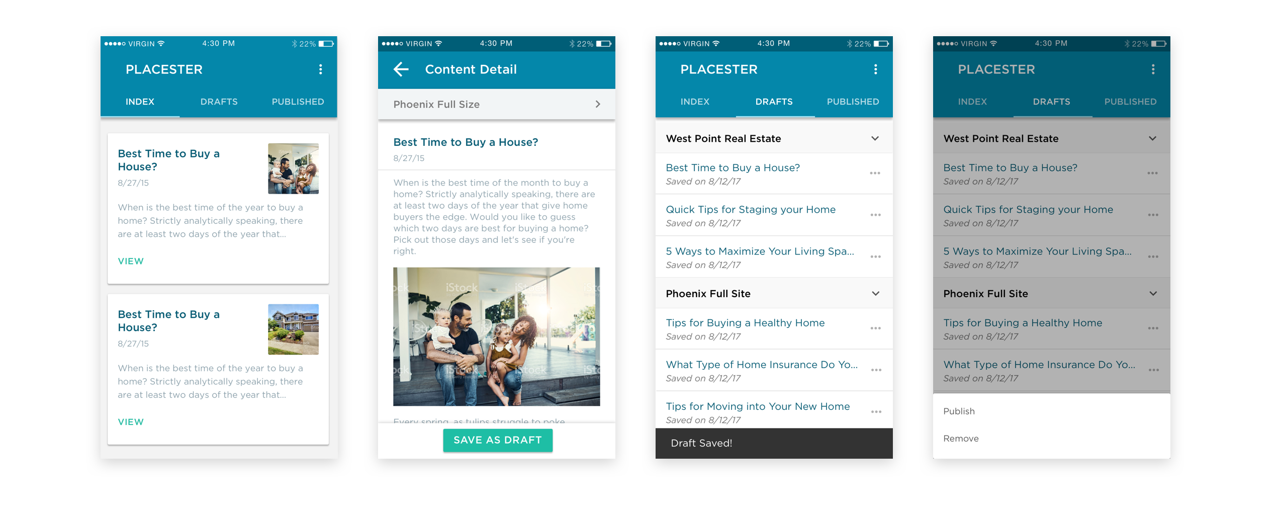
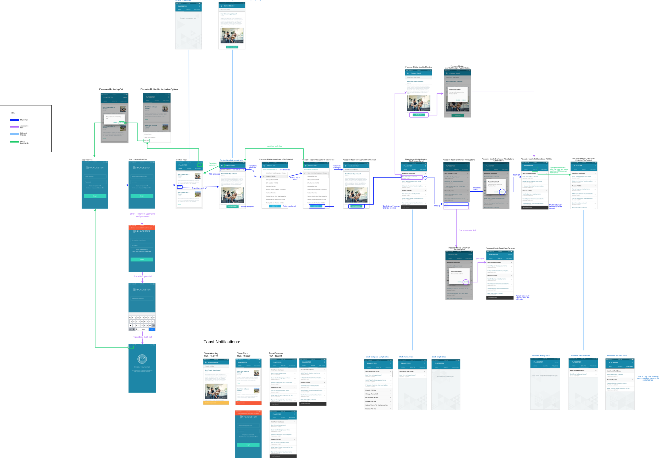
I created this flow diagram at the end of the project to help the engineers visualize the process better. A look-see into the redesigned version: This was the dashboard, the content detail, the drafts folder, and the publish/remove option.
Testing!