blistabloc marketing website
A website & eCommerce platform for a women-owned brand
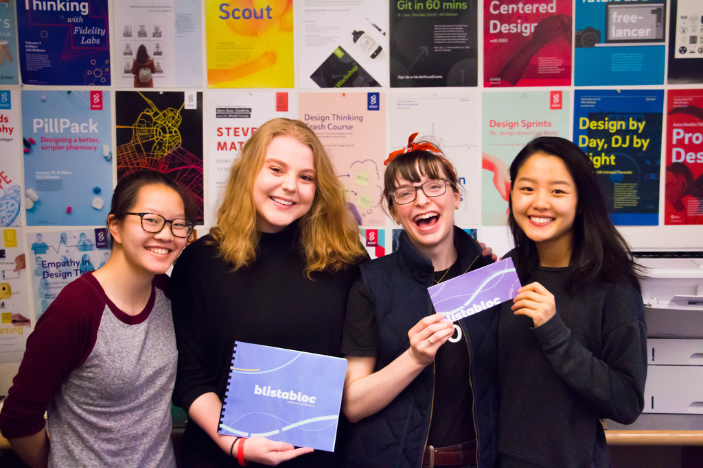
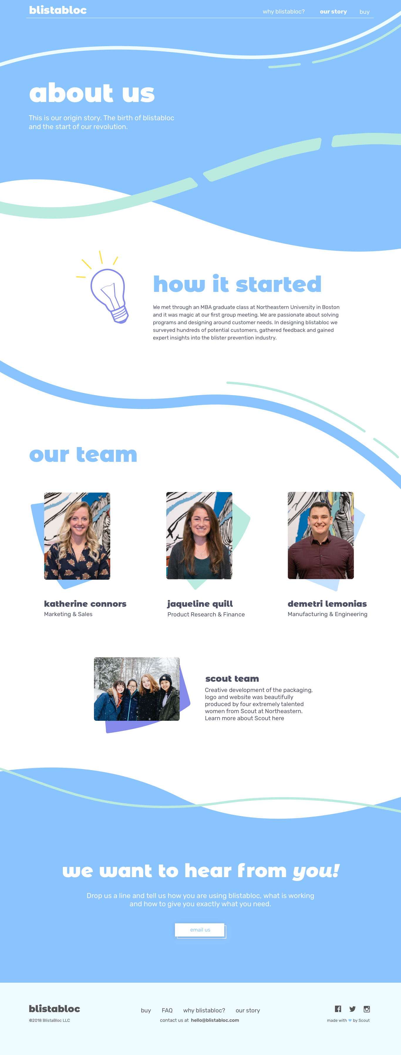
Katherine Connors and Jacqueline Quill were two Northeastern graduate students that applied to Scout as clients. They wanted to launch a blister-preventive tape into the market but needed to create their brand. They came to us with just a roll of this transparent tape and their market research. Our team’s job was to collaborate with them in order to create a well-rounded dynamic brand, packaging, and marketing website & eCommerce platform in a semesters time.
My Role
I was a designer in Scout Studio, working with Olivia, Sarah, and Brittany to make this tape come to life. My primary role was designing the brand identity and the website UX/UI. I specifically owned the eCommerce page and mobile responsive mocks and collaborated with Olivia on the rest of the pages.
Category
Branding, UX/UI
Project Duration
Spring 2018, Jan-Apr
Tools Used
Sketch, InVision, Illustrator
THE PROBLEM
How do we create an engaging & unique brand image for a simple piece of transparent tape? How can that be reflected on a website?
OUR PROCESS: RESEARCH & DISCOVERY
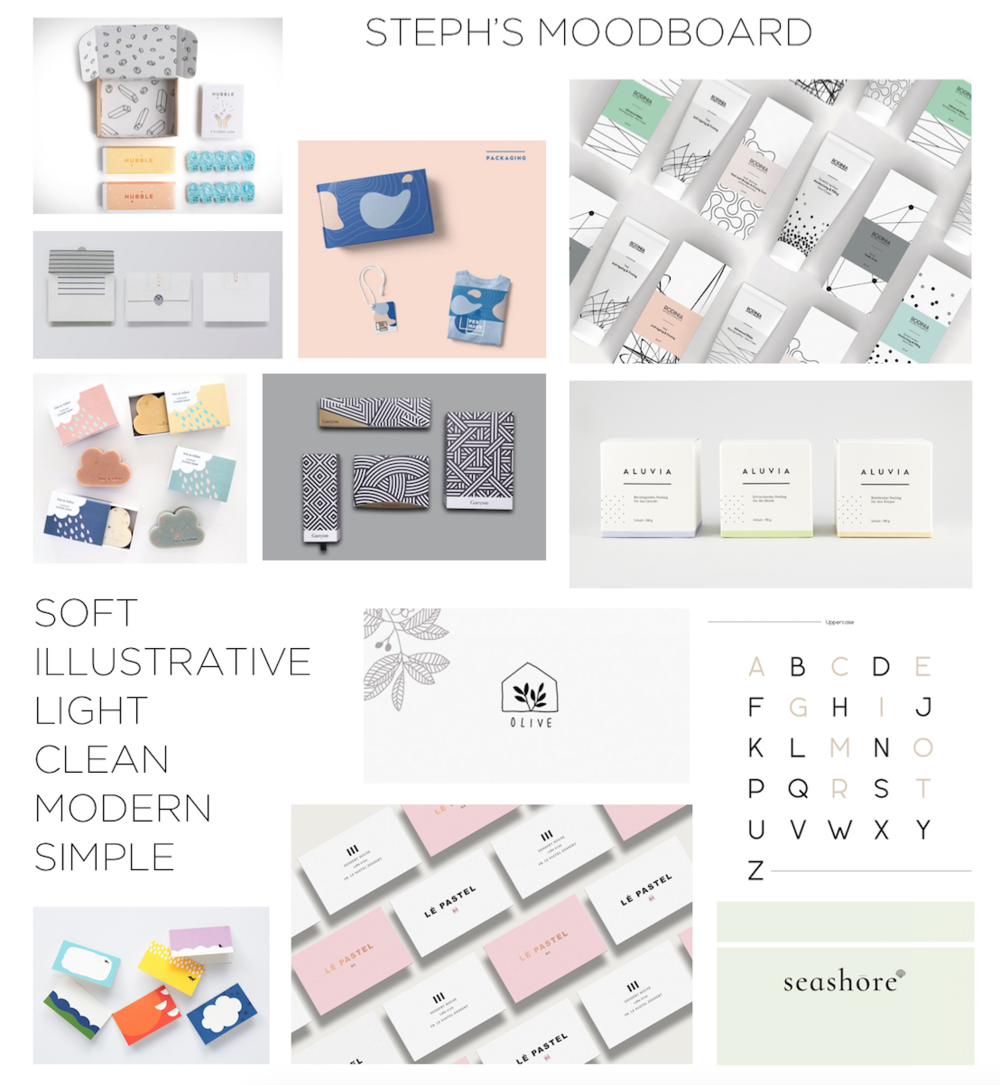
Brand exploration
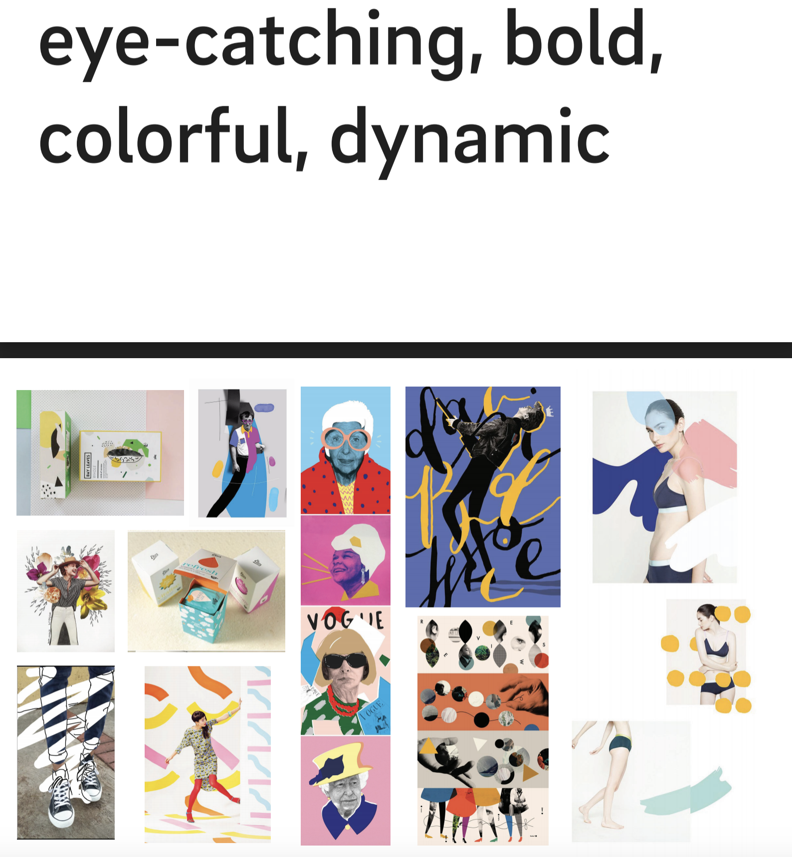
We spent quite a few weeks brainstorming, iterating designs, and giving feedback. One of the first things we did was create different types of mood boards to portray a certain brand feel. I thought of blistabloc as “healing,” so my board was more soft and light. Sarah’s compiled examples of bolder colors and big fonts.
OUR PROCESS: USER STORIES
Prioritize & narrow down user goals to set the baseline for the website
We sat down with Katherine and Jacqueline and wrote down as many user scenarios we thought would fit into the experience of the website. From there, we ranked them based on what was most important for us to do to least important. Here were some of the top stories that we wanted to achieve.
As a shoe-wearing person I want to easily view the product details and price of Blistabloc online so that I can be informed about what I'm buying.
As a potential customer, I want to easily be able to see what the product does and how to use it so that I don't have to make a lot of effort figuring it out myself.
As a Blistabloc customer, I want to provide feedback to Blistabloc so that I can help improve a product I’ve invested in.
As a non-tech savvy customer, I want the online ordering process to be intuitive so that I can buy the product online easily.
OUR PROCESS: COMING TO LIFE
How our brand came together
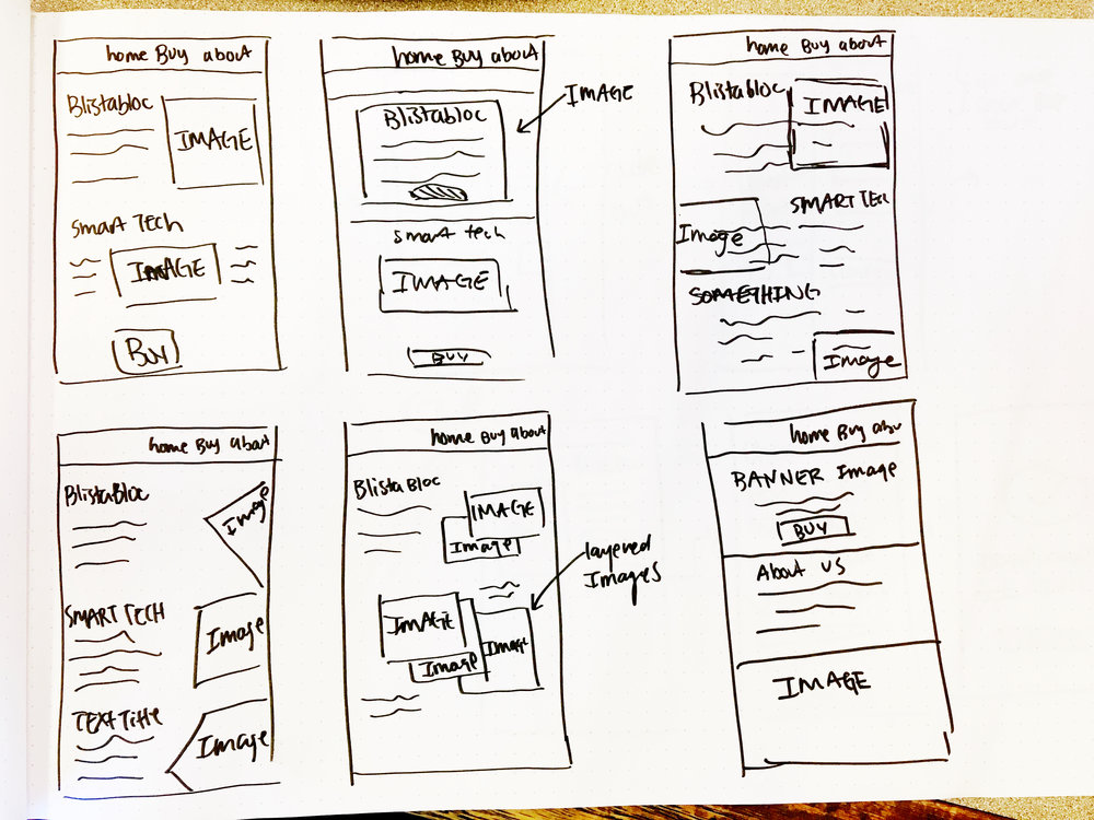
Phase 1: Low-fi Sketches
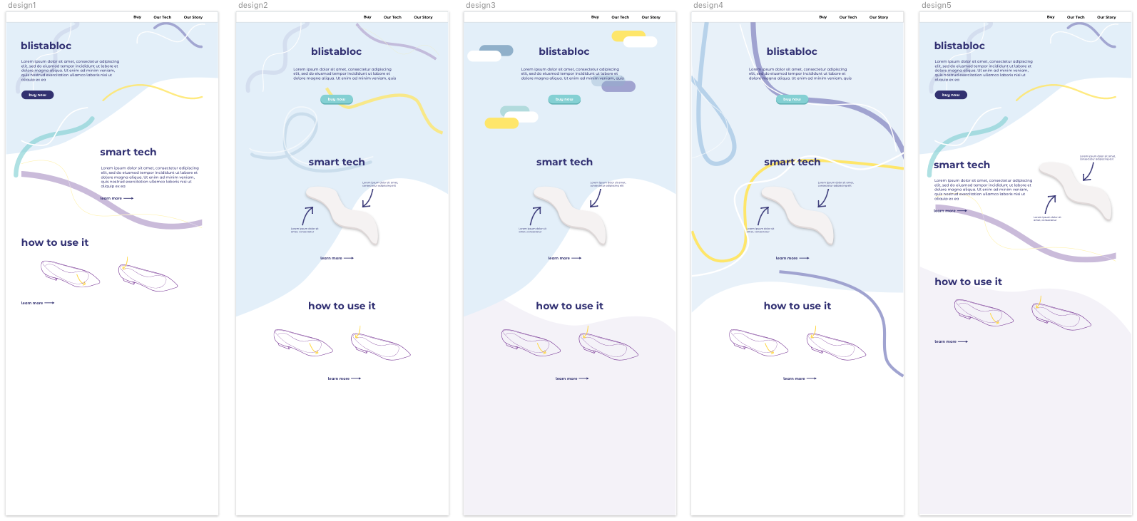
My project lead and I started mocking up potential homepage layout and designs based on the user stories. I started by drawing some rough layouts- since our clients weren’t sure about the content, I used my best judgment to decide where images and text could be placed.
At the same time, I was creating some potential eCommerce page layouts, thinking about the experience a user may have when they buy blistabloc on the website.
Phase 2: Mimicking foot steps
We used our brand colors to explore different elements on the website. The flowing lines were to mimick "footsteps" or "foot tracks," as well as movement.
Phase 3: Applying more colors & pushing the movements of lines
- We wanted to use the primary blistabloc purple as the header to make the website have some "pop"
- The lines were used to break up information, and we ended up creating dashed lines to mimic the "footsteps." We had thinner supporting lines to just create some variation and flow.
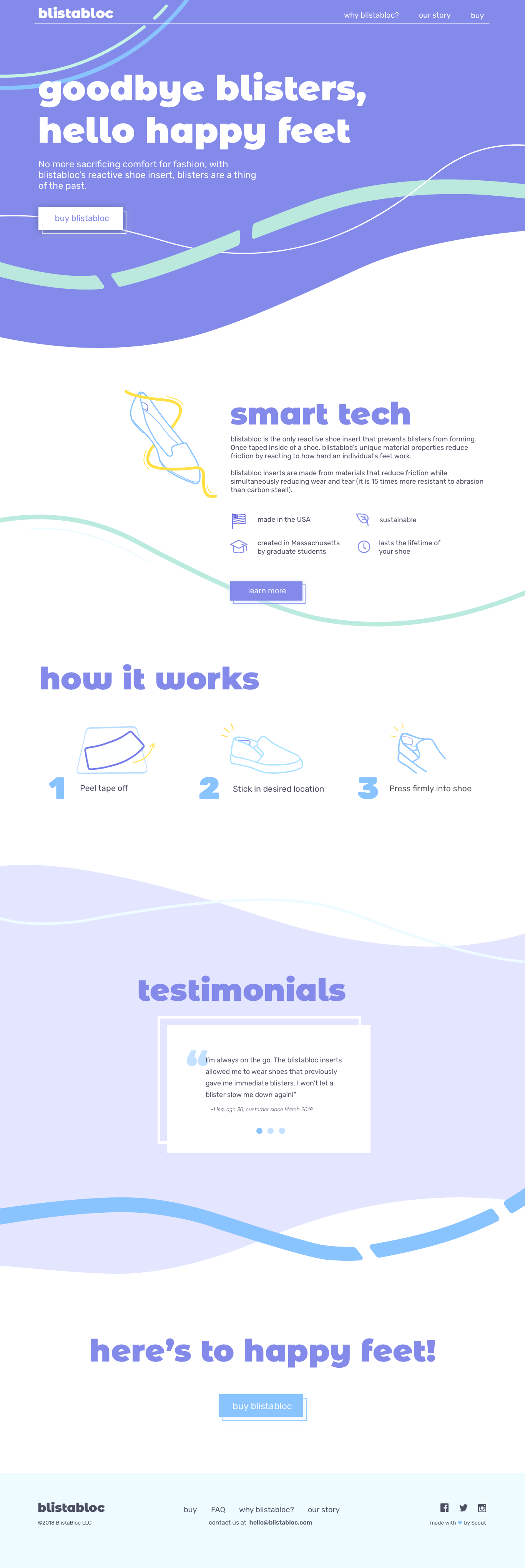
FINAL PRODUCT
A marketing & e-commerce platform that is fun, engaging, and intuitive
Part 1: Homepage overview
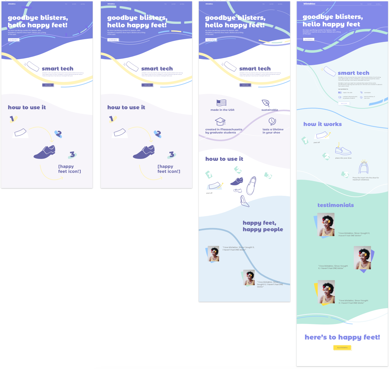
Our homepage was finally done! (While this version of the website was live for about two years, Katherine and Jacqueline recently redesigned the website again)
- We wanted the brand to be fun, bold, and engaging since the actual product is so plain. We opted for a large, bold header and a big CTA button to prompt customers to go to the buy page. The big green dotted line (and the other lines on the website) imitates “foot tracks” and is complemented by a thin white line to balance it out.
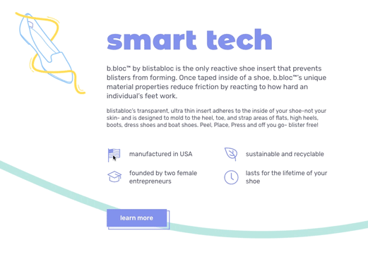
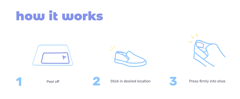
- We didn’t want to overwhelm the page with so many lines so we kept it simple with a few here and there- just to get that idea of fun and flowy. We wanted the customers to be educated as they scrolled down, so the top header was a general description, then we explained what it really was under “Smart Tech,” then came instructions on “how it works,” “testimonials,” and finally and final CTA to buy the product.
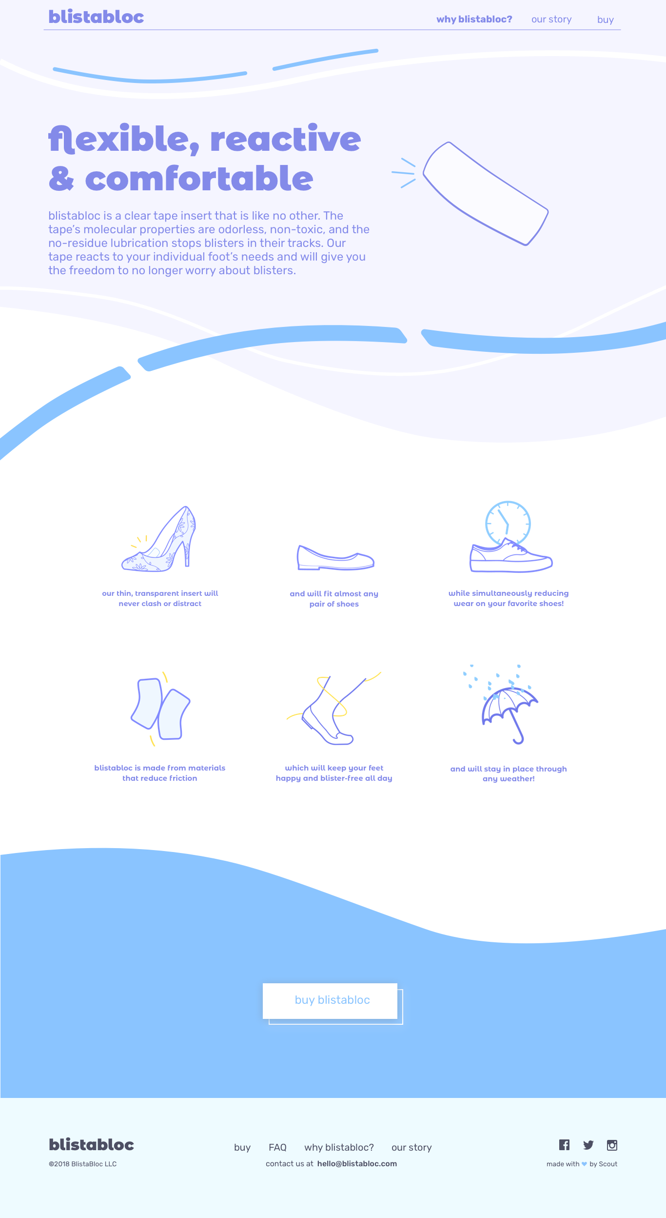
Part 2: Why blistabloc? and About pages
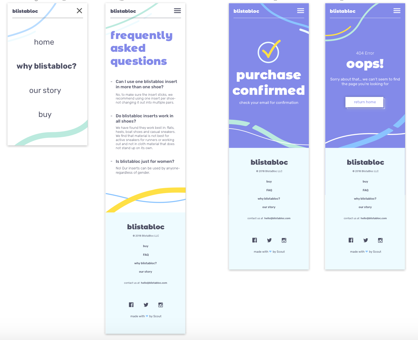
The other tabs in the website included a "why blistabloc?" and "about us." We used the secondary colors for the headers here, including some lines to break up the information. Our website was heavily illustration based to create a more fun and friendly interface. Most of these illustrations were animated as well.
Part 3: Illustration Animations
We added in little details here and there to make sure our website was as engaging as possible. Sarah created the animations Olivia and I wanted to include under the sections. I created a playful, purple cursor that moves the drawings on hover!
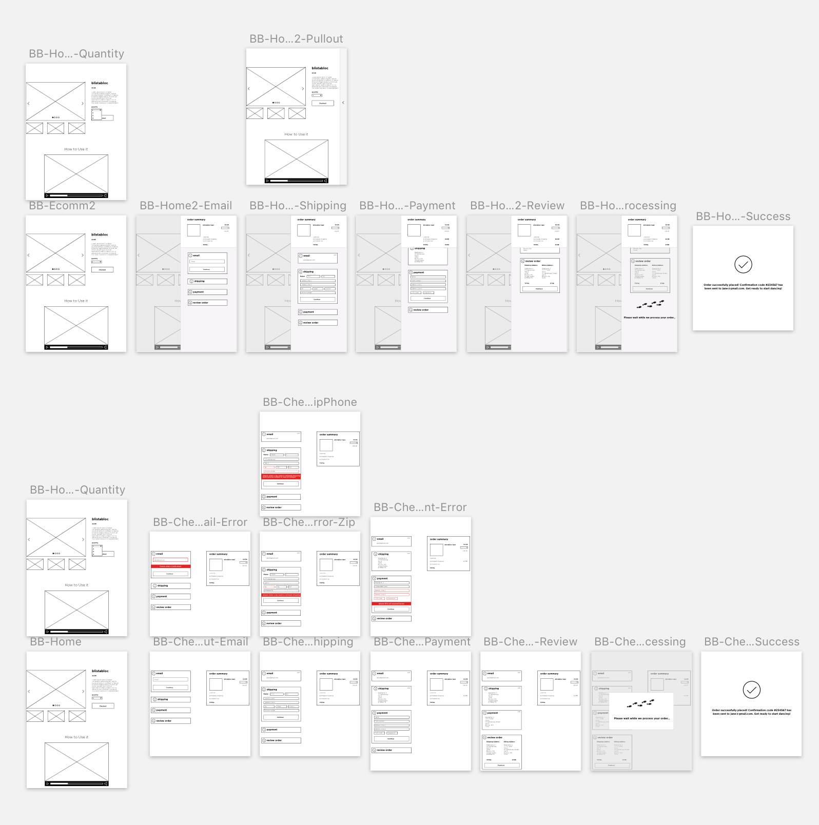
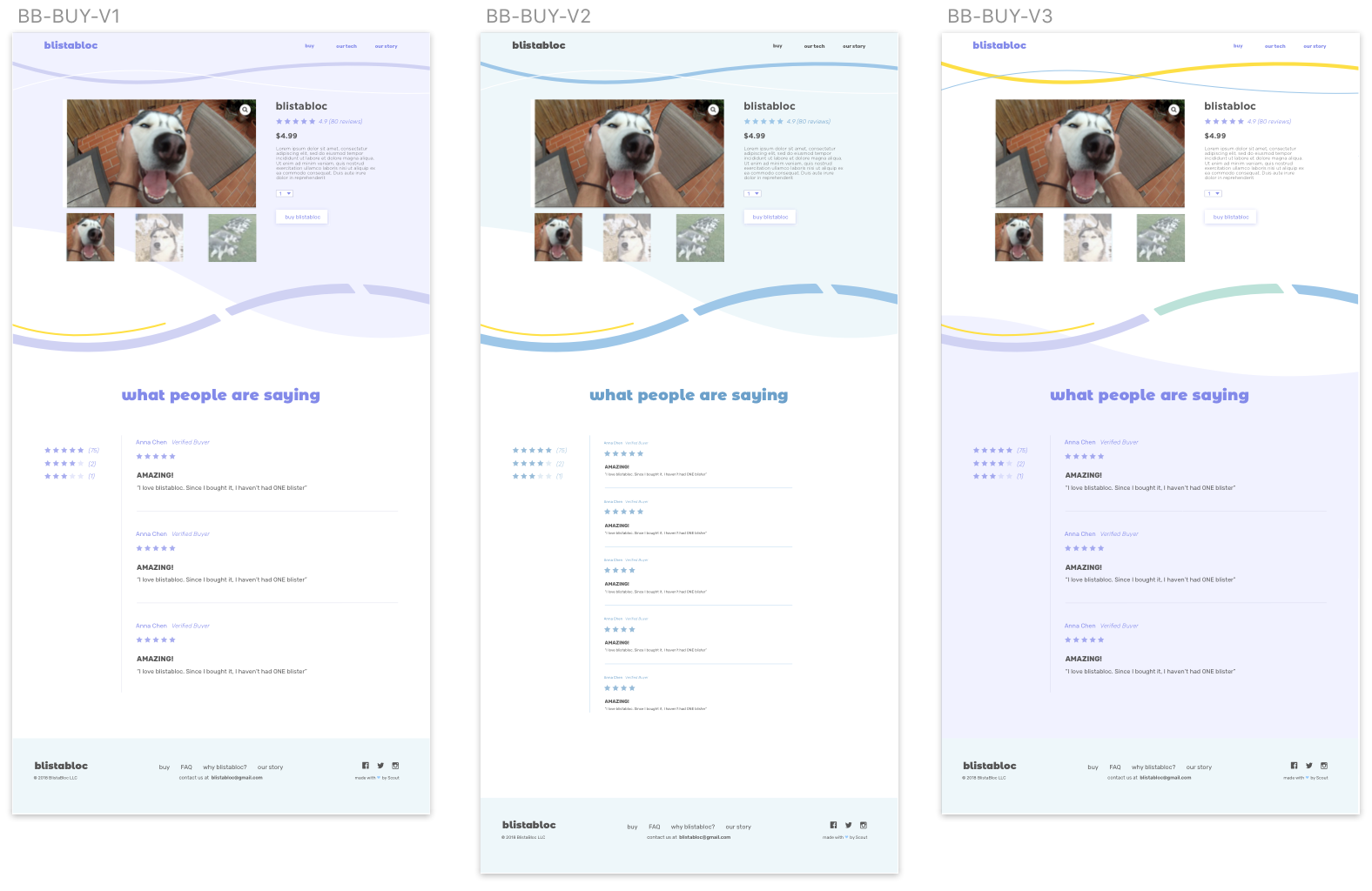
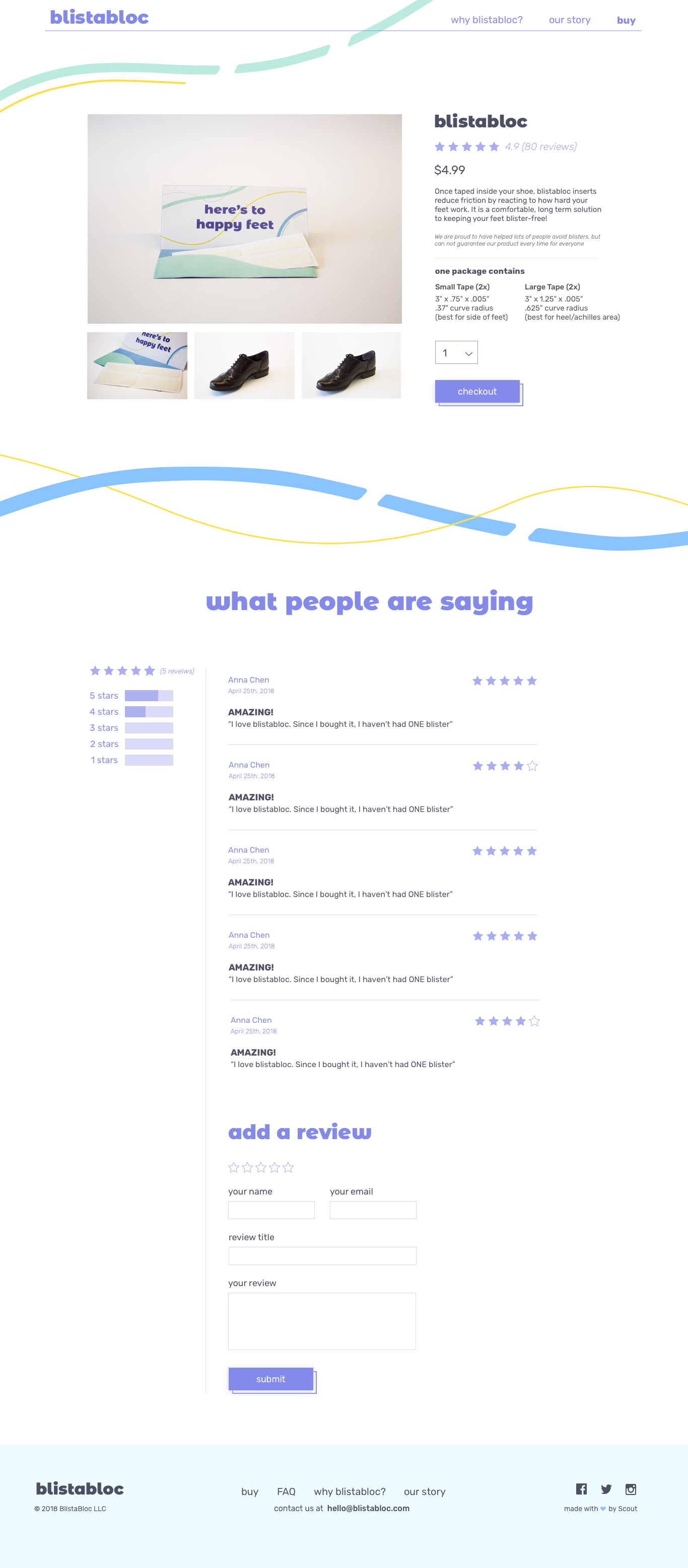
Part 4: eCommerce platform
After critiquing and editing, I decided to keep the top background white so it wouldn’t distract from the pictures. I wanted to still add in some color so we used the lines to do so- making sure not to use too many different colors. The reviews section went through several rounds of edits to make sure it was easy to read at first glance.
Sarah made a prototype packaging out of her packaging designs and took mock pictures for the initial build-out of the platform. Our creative developer, Brittany, did an amazing job building out the whole platform using Timber and Woocommerce!
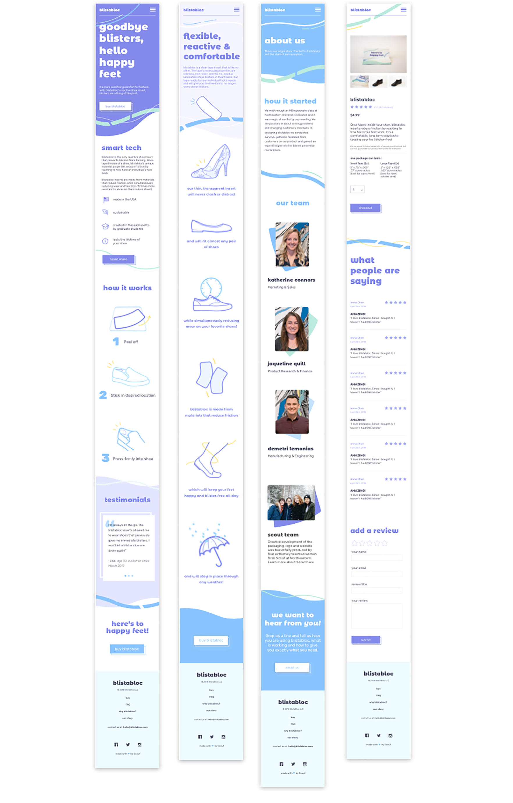
Part 5: Mobile version
FINAL PRODUCT
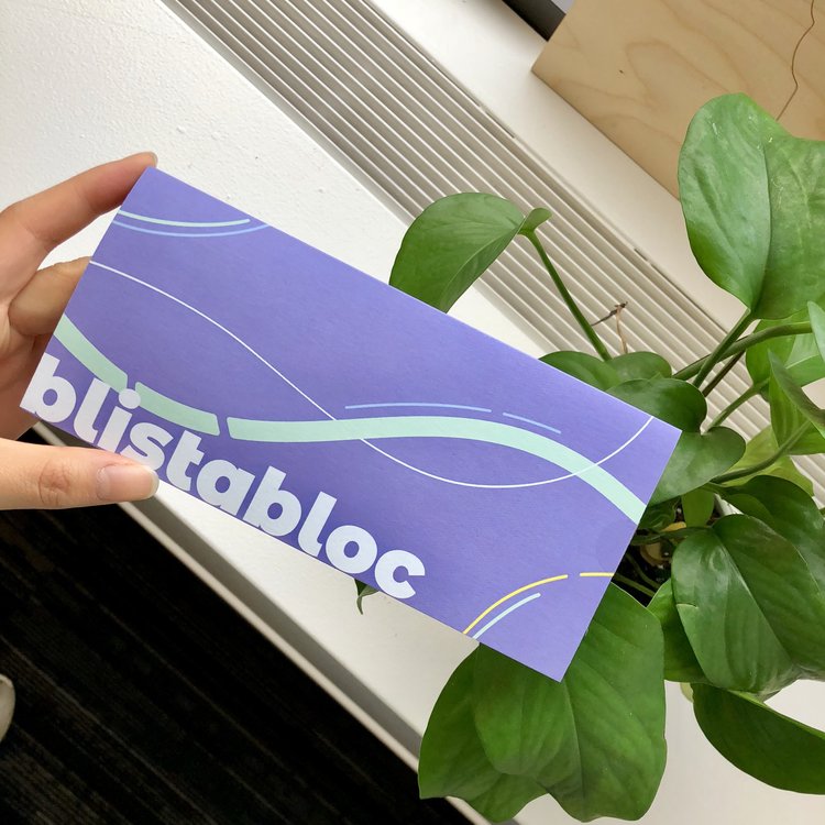
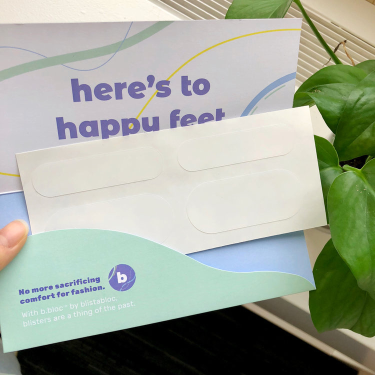
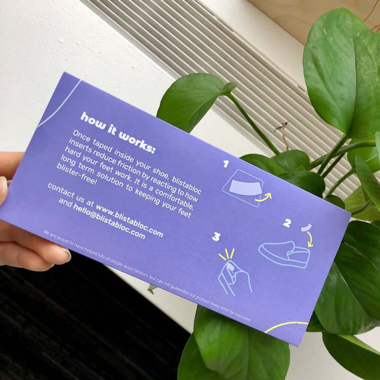
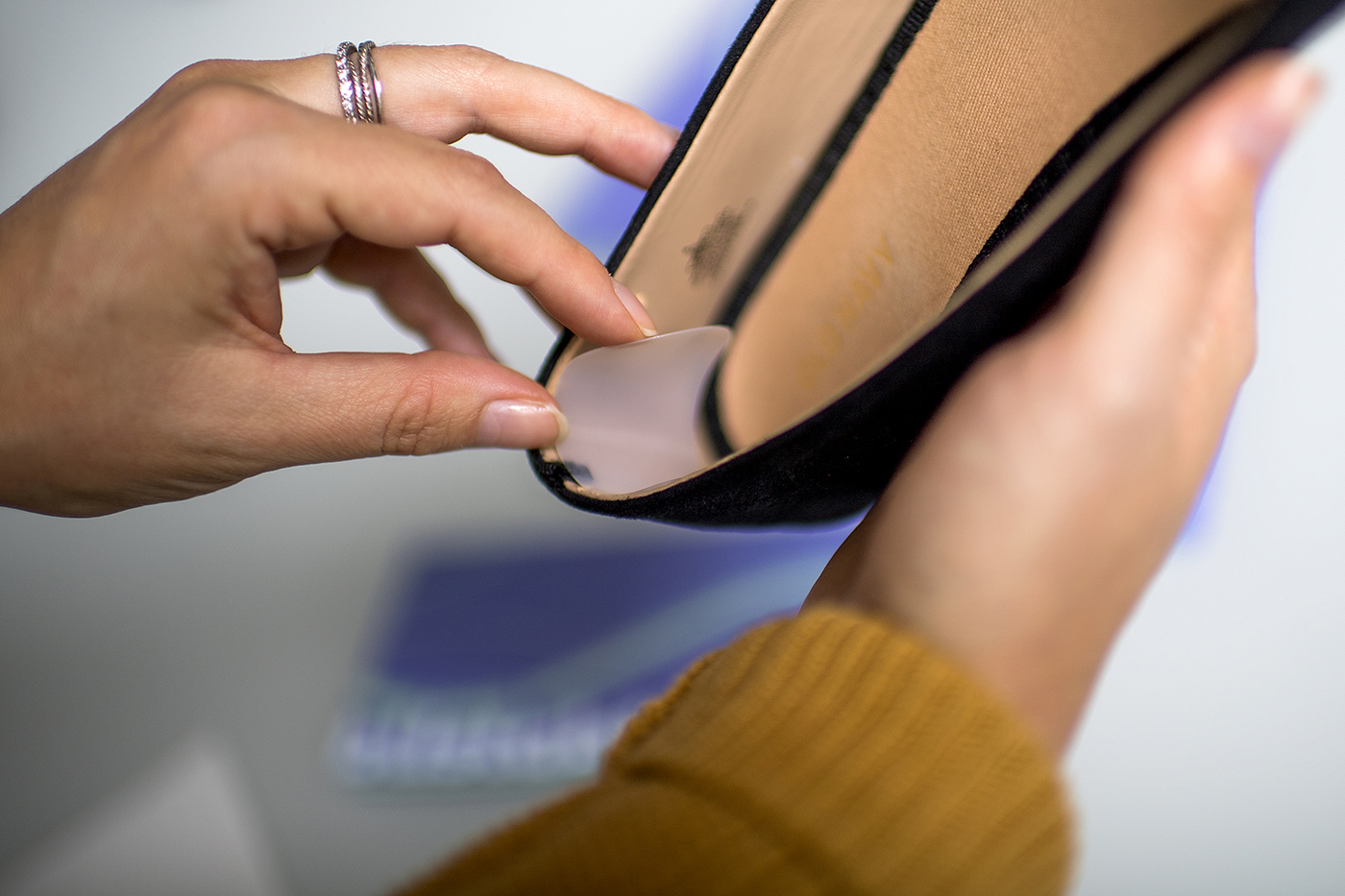
Final packaging design & physical product
While Olivia and I worked on the website, Sarah owned the packaging design and I want to show you what the final physical product looks like!
Katherine and Jacqueline finally launched blistabloc on August 29th, 2018! Since then, they have sold over 7,000 units and are continuing to sell more! Here are some shots of the final product that they sent to us when it got launched: