Enhancing Location Visibility for Emergency Calls
Rethinking the way we convey 911 caller location and mapping experiences to call takers
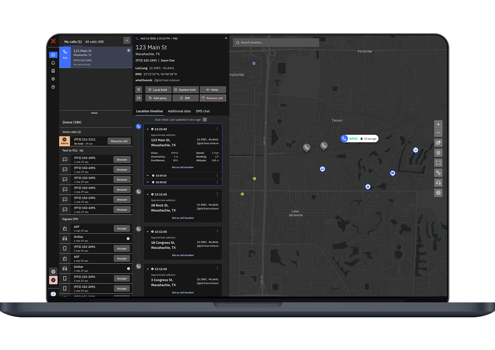
RapidDeploy has an ecosystem of cloud and mobile software for 911 call takers, dispatchers, and first responders. Radius, specifically, is RapidDeploy's flagship mapping and telephony tool. 

Primary user
9-1-1 call takers; the person behind the phone when someone calls 9-1-1. They are responsible for relaying the caller's location information to dispatch so first responders can get to the incident scene as quickly as possible! 
Use case
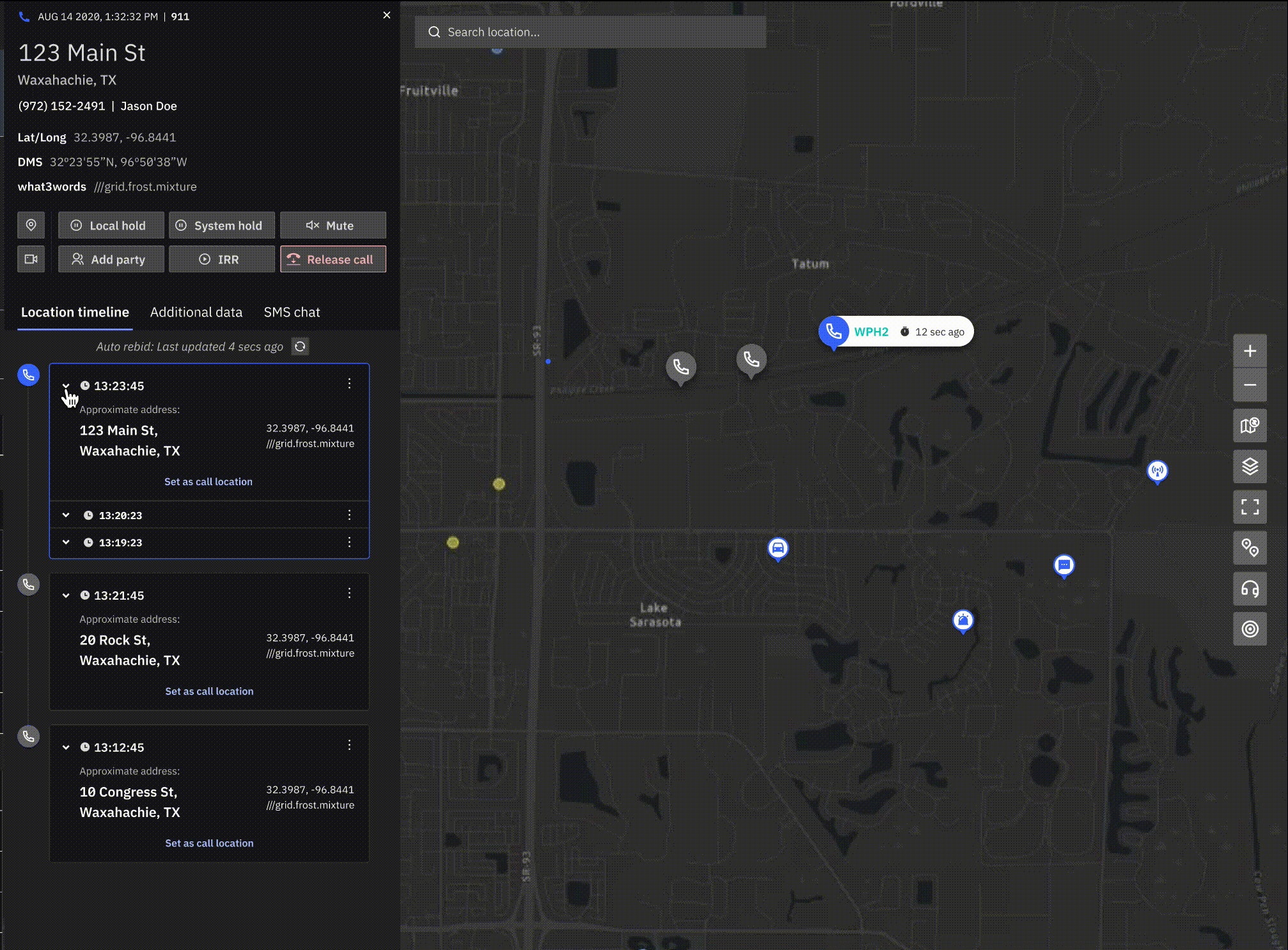
For this project, we focused on the mapping and location experience. Call-takers use the location cards to track the caller alongside the map.
Problem
Call takers could not clearly understand when a caller was moving or stationary. Additionally, the information layout on the location cards made it difficult to scan and process address information. This slowed down dispatching activities.
Goal
Redesign existing elements to create a system that could group identical locations and improve information readability.
Ultimately this would minimize 911 call taker response time for an incident, getting people to safety quicker.
My Role
I owned the design execution and was responsible for taking this user feedback to reimagine this experience. I drove both the UX & UI and created a final prototype to demonstrate to key stakeholders and users. I collaborated with my team of 4 designers, 1 PM, and an engineering team.
Category
Product design
Project Duration
3 weeks
Tools Used
Figma
THE PROBLEM
Call takers could not clearly understand when a caller was moving or stationary, preventing them from relaying address information to dispatch quickly. Information readability was poor
- Location updates from a 911 call can come in very frequently, anywhere from 5-30 secs. Additionally, each location can have a different accuracy % and supplemental information.
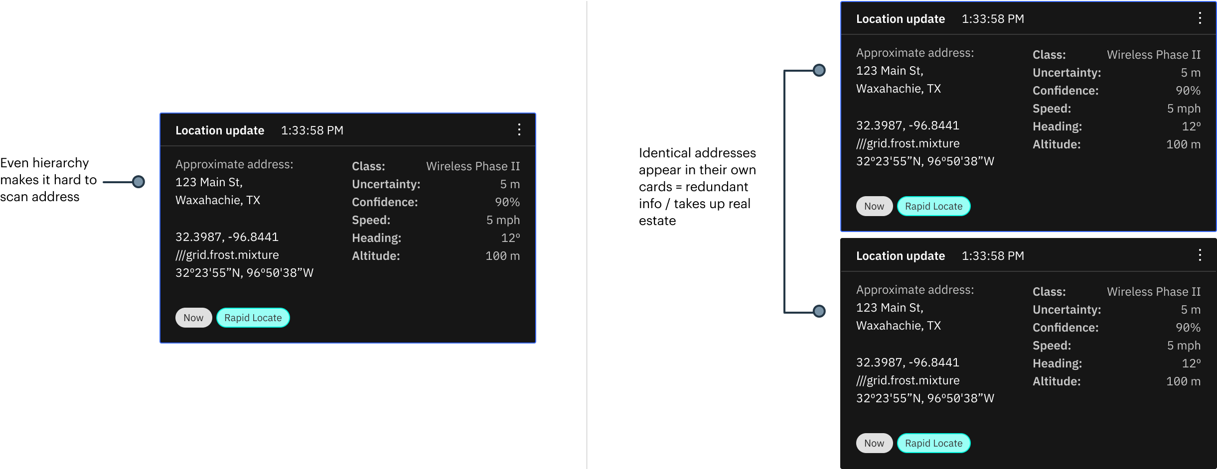
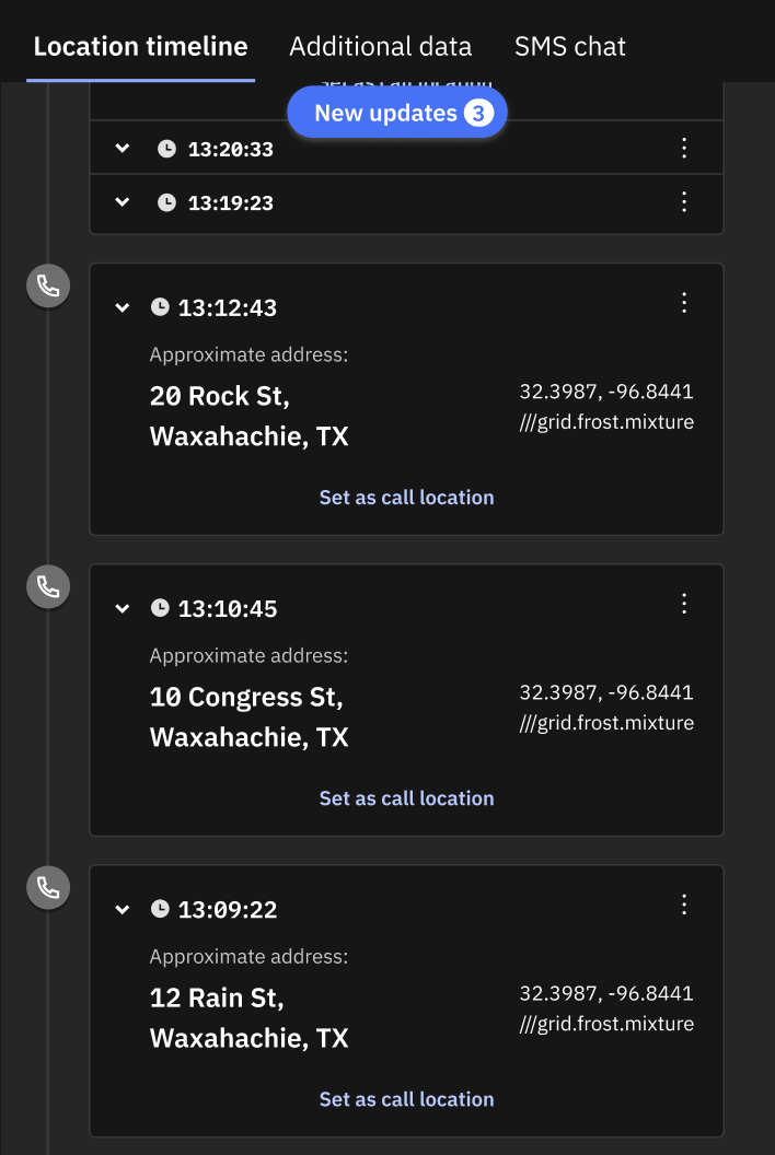
- Every time there was an update to a caller’s location, the call taker would get a new location card in the timeline- no matter if it was identical to an existing card.
It was incredibly difficult for 911 call takers to pinpoint address information quickly, or understand if the caller was on the move or staying still.
THE SOLUTION
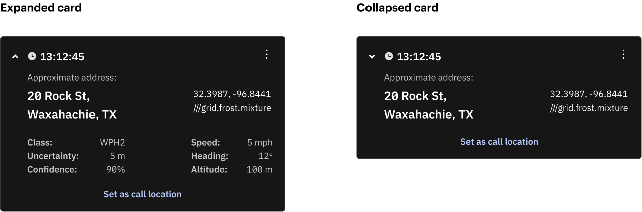
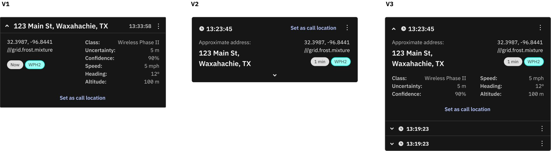
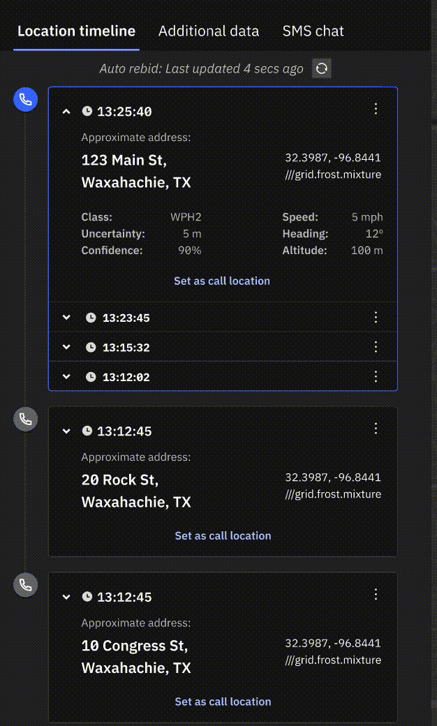
1. Improved Text Hierarchy
The address is now the biggest, most important piece of information, and all other details can be collapsed and hidden, giving more real estate to the screen especially when there are many locations coming in.
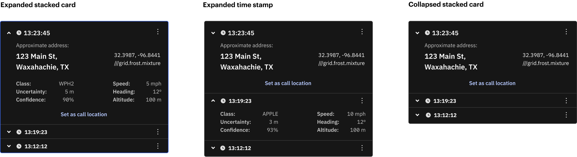
2. Consolidate Identical Addresses
With identical addresses, we stacked them together by the time the location came in (timestamp) instead of giving each their own giant card. Since the information was almost identical, we automatically collapsed the timestamps.
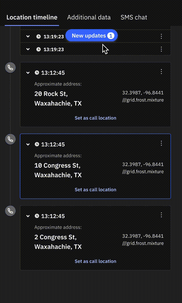
3. More Control Over Location Upates
Originally, whenever a new location was received a new card could come in, bumping everything down and disturbing the workflow of the call taker. With a "new updates" button, a call taker would control when they want to refresh location updates
MY PROCESS: USER RESEARCH
Understand Information Hierarchy
What is the most critical information to call takers and what is secondary information?
From talking to 7+ public safety dispatch centers, we gathered that:
- The incident location address was the most important, along with the time it came in at (timestamp)
- Long/lat coordinates were utilized frequently as well, but second to priority to location
- Everything else could be secondary information
Other complaints we heard were:
- Incident cards are way too long, limiting the number of locations they could see on the screen at once
- The cards keep moving down every time a new location card comes in, which disturbs their workflow, especially when they try to copy and paste it
MY PROCESS: UI EXPLORATION
UI Ideatation Informed by Feedback
Since the first step was to make the cards easily scannable, I utilized my design team and together we explored a bunch of different layouts of text hierarchy that could work given these requirements:
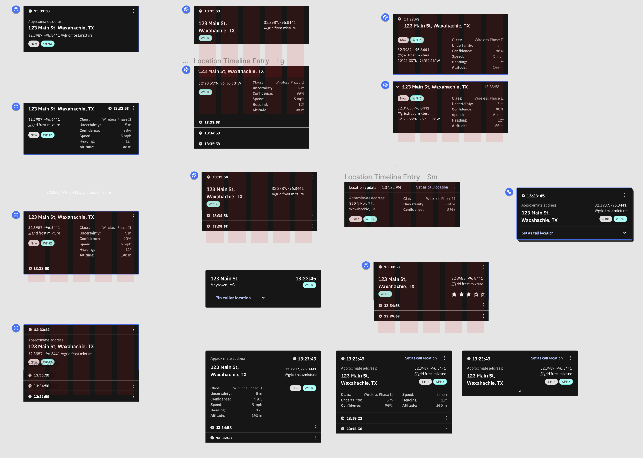
Then, I narrowed down what I thought would be the best layout for the cards.
- I used the top header as the timestamp, pairing it with an icon to break up the text.
- I increased the sizing and bolded the address, distinguishing it from all other text.
- I got rid of the tags, as they were too distracting, and the information inside was redundant.
- I hid the secondary information when collapsed since call takers only need it in some instances.
- The "Set as call location" button was the CTA, so I ended up bringing it to the bottom of the card to emphasize it.
Here are some iterations I made that were close to the final layout:
MY PROCESS: COMPLEXITIES
Define Identical Locations
One of the main complexities of this project was understanding what constitutes an identical location:
For example, a school building could have one singular address but can span thousands of square feet and floors. The caller could be traveling anywhere through the school and would still register as the same location. Therefore, we needed a way to set certain parameters in long/lat and altitude to trigger a new location card. This way the call taker can be notified that this caller is on the move.
How do we define when an incident card would split into two separate cards even with identical addresses? 
After meetings with PMs who were experts in mapping, we leaned on setting certain parameters for distance:
IF X/Y (long/lat) distance changed by at least 10 degrees
OR elevation distance changed by at least 3 meters
OR subaddress elements changed (like apartment numbers)
--> THEN a separate location card would be created.
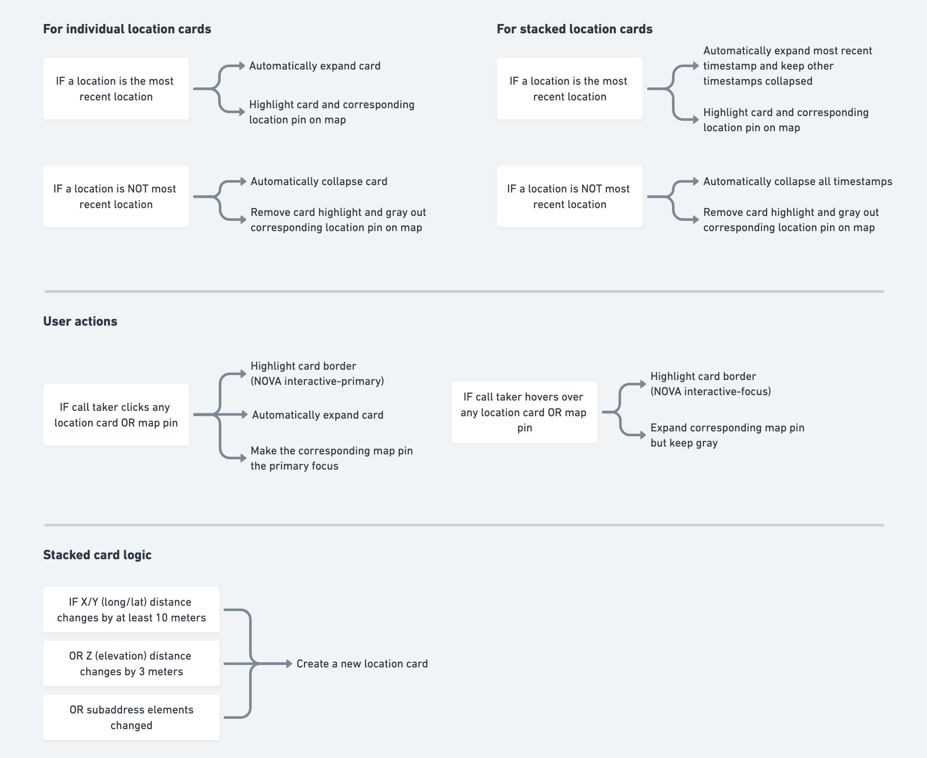
MY PROCESS: DECISION TREE
Architect Card & Map Scenarios
After presenting the new designs and discussing card logic to various stakeholders, I then created a decision tree to lay out the interaction for the engineering team. This was also so everyone could have the interaction as a point of reference.
FINAL PRODUCT
Improve visual cues for stationary vs moving callers. Give call takers control of how much information they want to see, enabling quicker workflows
Expandable and collapsable location cards that are contextual to corresponding map pins
Identical addresses are stacked in the same card, saving precious real estate
Dispatcher chooses when they want to see new location updates, so their workflow is not disturbed
MY PROCESS: RESULTS & REFLECTIONS
We tested with call takers to validate if the new designs would solve their problems
The great news was that all call takers were ecstatic about the new layout, stating that "I can definitely see the location a lot clearer now." They were also appreciative of the expand card functionality since they validated that they only really need the address and long/lat most of the time.
One piece of feedback we got was incredibly valuable. We realized we overlooked the logic of the timestamp order. It's a lot easier to explain if I can show you- so if you're interested, let's connect and chat :)